Project Overview and Scope
Project Name: Concordia App
Partnering with the Good Samaritan Haitian Alliance Church and Dominican Republic in-country allies, Concordia is a collaborative application aimed at coordinating services and volunteer teams in impoverished Dominican communities. The platform streamlines resource allocation, reduces duplication, and optimizes service delivery through user-friendly interfaces, customization options, and comprehensive training and support.
Project Role
As a product designer on the Concordia project team, I collaborated with a diverse group of seven team members, including a Design Manager and Product Manager. My responsibilities encompassed conceptualizing, researching & designing user interface elements for the Concordia app sign-up & account creation process. Working closely with the Design Manager, I translated project requirements into visually appealing and user-friendly designs. Additionally, I liaised with the Product Manager to ensure alignment between design strategies and project objectives, contributing to the overall success of the Concordia initiative.
Project Goal and Problem
Project Goal
The primary goal of the Concordia project is to establish a unified platform that enables their onsite partner, Meeting God In Missions, to efficiently coordinate with other onsite organizations and teams. This platform aims to streamline service delivery processes to various communities in the Dominican Republic, ultimately impacting thousands of predominantly impoverished sugar cane workers.
Problem Statement
The current lack of a centralized coordination system leads to inefficiencies and overlaps in service delivery efforts across the Dominican Republic. Without a unified platform, onsite partners struggle to effectively collaborate and allocate resources, resulting in fragmented services and limited impact on the communities they serve. The Concordia app project seeks to address these challenges by providing a comprehensive solution that facilitates seamless communication, resource allocation, and collaboration among onsite organizations and teams.
The Process
User Research and Ideal Customer Profile
I collaborated with a fellow designer to conduct user research and develop an ideal customer profile.
Objectives of Research
- Identify user needs and preferences.
- Determine the demographics most likely to use the app.
- Understand user interaction patterns with apps.
- Explore user sentiments regarding communication on the app.
- Analyze users' favorite apps and desired features.
- Identify potential improvements for the app.
Research Methods
I utilized both qualitative and quantitative research methods, with a focus on qualitative approaches. I also conducted surveys to gather diverse user feedback on app usage, pain points, and goals. My fellow designer gathered data from online sources to gain additional insights into user behavior. We continuously collected user feedback throughout the project's development stages.
User Interviews/Personas:
We developed user personas based on interviews and demographic data. Examples include:
User 1: Female, aged 35-56, from the USA, tech-savvy, prefers app notifications; and User 2: Female, aged 35-56, from the Dominican Republic, faces financial constraints, moderate tech proficiency.
Key Findings:
We identified older millennials and gen-x as primary age demographics for volunteering and found that both genders engage in volunteering, with men slightly more likely to volunteer. We highlighted the importance of mobile-first design due to high mobile phone usage among the target audience and discovered preferences for easy-to-understand, visually appealing app designs. We recommended social media outreach to increase app awareness and engagement.
Ideal Customer Profile (ICP):
Age: 46
Location: USA
Language: English
Pain Points: Difficulty tracking events in other areas
Goals: Continued community volunteering
Preferred Features: Event scheduling, real-time updates, community benefits display
Tech Familiarity: Very familiar, especially with smartphones
Preferred Notification Method: App notifications and email newsletters
Recommendations
Prioritize mobile-first design for app development.
Ensure inclusive and visually appealing app designs.
Implement social media sharing features to enhance app outreach.
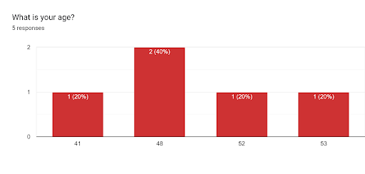
Chart showing age range of users
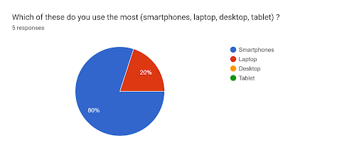
Chart showing users device usage

Chart showing information receiving preference of usage
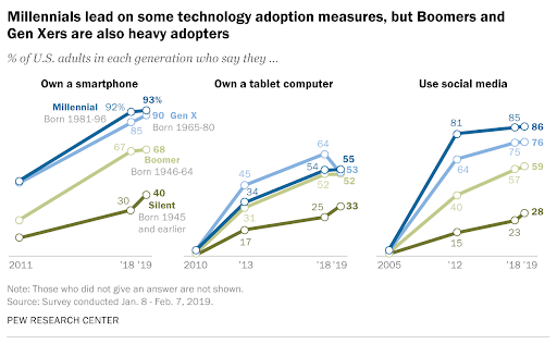
Chart showing device and social media usage of users
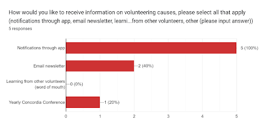
Chart showing information receiving preference of usage
Design Research
Through the meticulous user research done, we delved into the nuanced needs and behaviors of our target audience, facilitating a profound understanding of their preferences and pain points.
This comprehensive user insights directly informed the design process, guiding decisions to create an intuitive and impactful app experience. From identifying key demographics to understanding preferred communication methods, every aspect of Concordia's interface reflects the user-centric ethos cultivated through rigorous research.
My Tasks
Asides from the User Research, I was tasked with creating intuitive and engaging interfaces for key components, including the Account Creation, Sign-up/Login, Splash screens, homepage, and screens that have to do with onboarding. This involved a comprehensive design process, from initial paper wireframes to refined digital wireframes and both lo-fi and hi-fi screen designs. Throughout the iterative process, I solicited and integrated feedback from stakeholders and team members to ensure alignment with project objectives and user needs. Additionally, I conducted prototyping to visualize user interactions and refine the user experience iteratively. My role was crucial in translating user research insights into tangible, user-friendly interface designs that enhance the overall usability and appeal of the Concordia app.
Wireframe Sketch
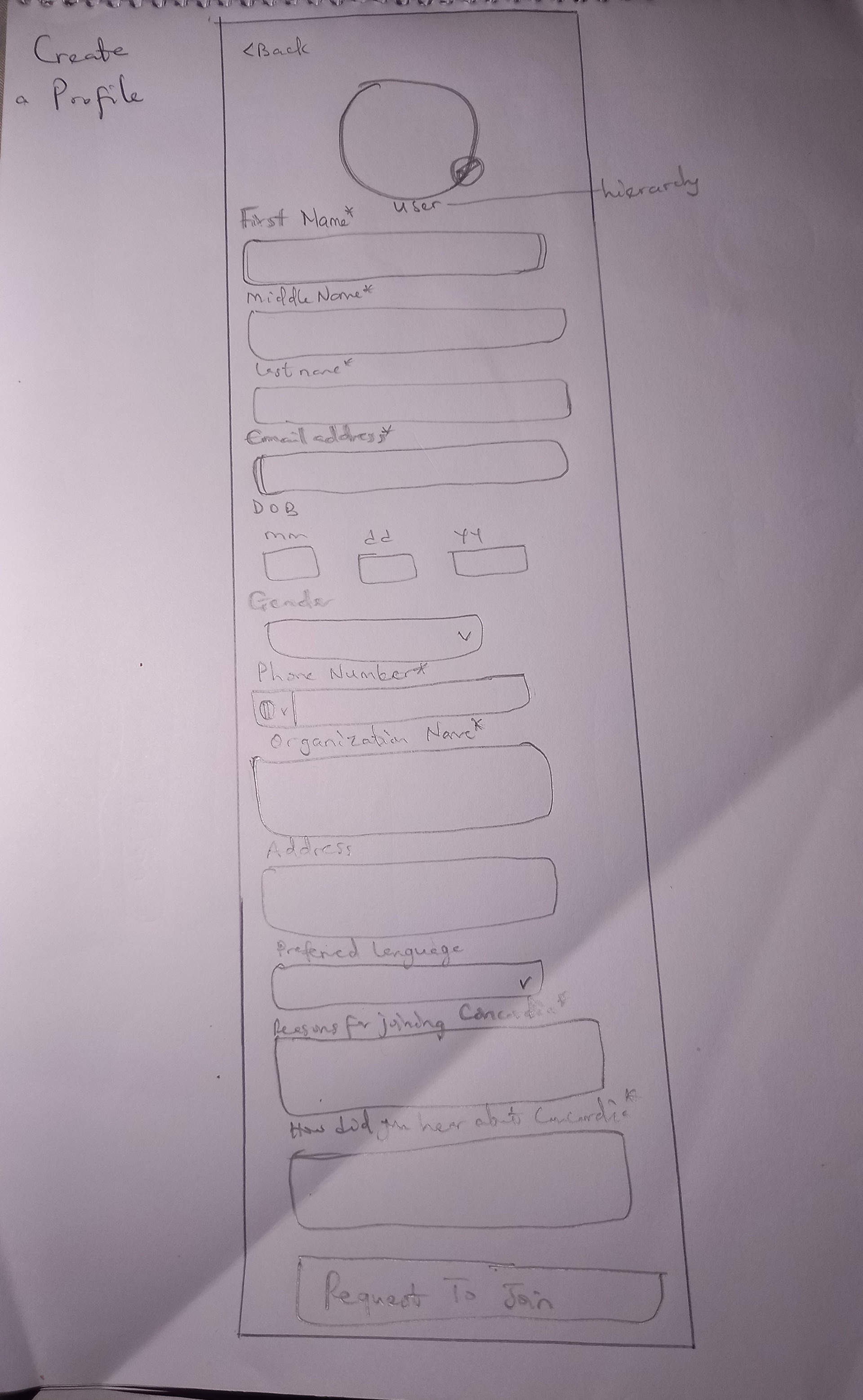
In developing the initial paper wireframes for the Concordia app, my foremost focus was on balancing stakeholder needs with user requirements. Through meticulous analysis of stakeholder feedback and an in-depth understanding of user needs obtained from research, I strategically prioritized features and layout elements. Each wireframe iteration aimed to seamlessly integrate stakeholder insights, ensuring alignment with project goals, while concurrently addressing core user requirements for intuitive navigation and functionality. By prioritizing this dual perspective, the paper wireframes served as a foundational blueprint, effectively bridging stakeholder expectations with user-centric design principles to drive the design of a cohesive and user-friendly app interface.

Initial paper wireframe for Profile creation
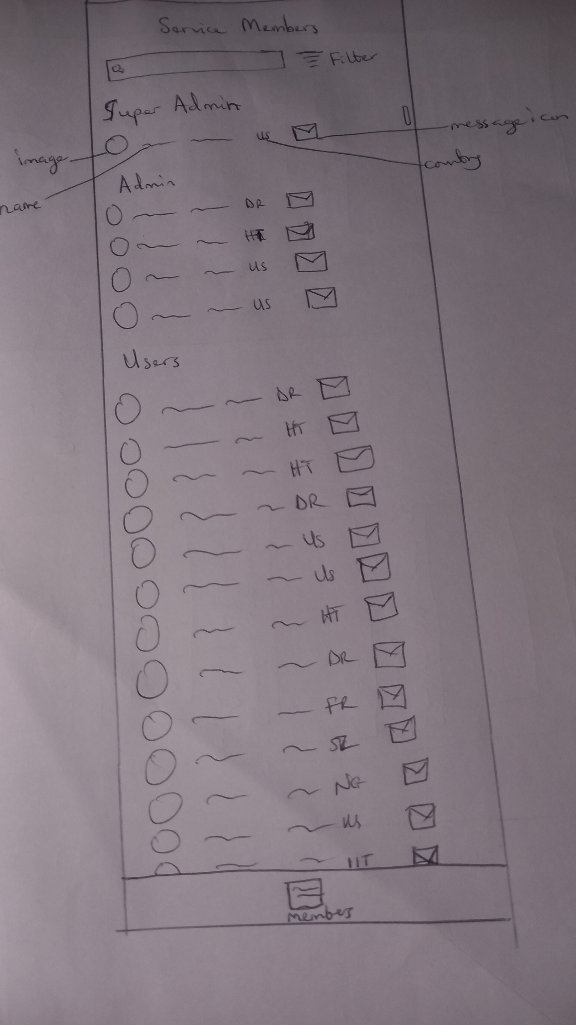
Initial paper wireframe for members service list
Digital Wireframes
In transitioning from paper to digital wireframes for the Concordia app, my focus extended to refining the user experience and incorporating feedback from stakeholders and designers. Particularly, I dedicated significant attention to enhancing the Profile Creation page, ensuring its alignment with user expectations and project objectives. Upon receiving feedback from the design manager, I iteratively refined the digital wireframe to address suggestions and insights, ultimately crafting a more polished and user-centric interface.
Furthermore, my involvement extended to the initial creation of the digital wireframe for the homepage. While laying the foundation for this crucial aspect of the app, I integrated key elements such as splash screens, service members list, and more, aiming to create an engaging and informative entry point for users. Subsequently, leveraging feedback from the stakeholders, the design manager further refined and optimized the homepage design, ensuring its coherence with the overall app vision and delivering a seamless user journey. Through this iterative process, the digital wireframes evolved into a comprehensive representation of the Concordia app interface, meticulously tailored to meet both stakeholder expectations and user needs.
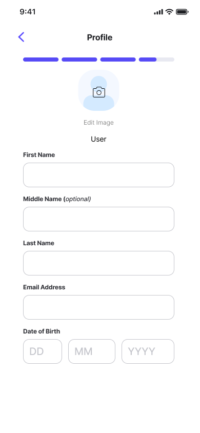
Profile creation page 1
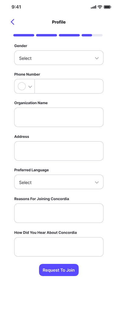
Profile creation page 2
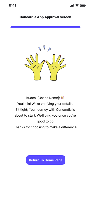
Approval screen
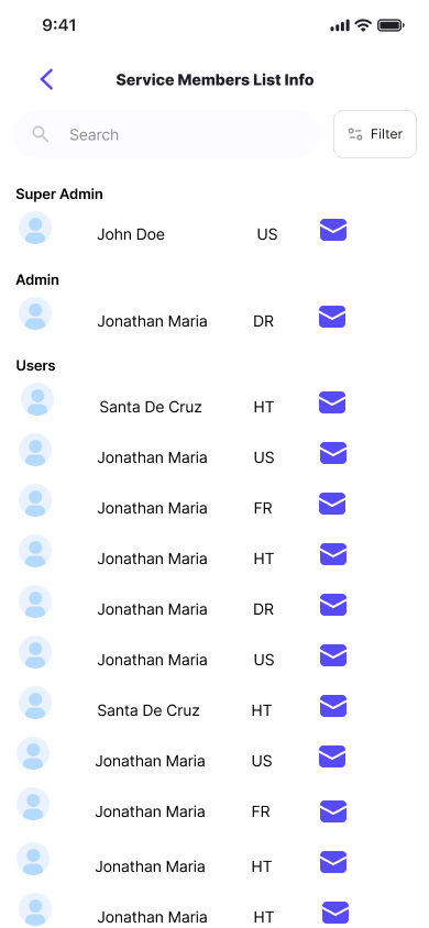
service members list info

initial homepage wireframe
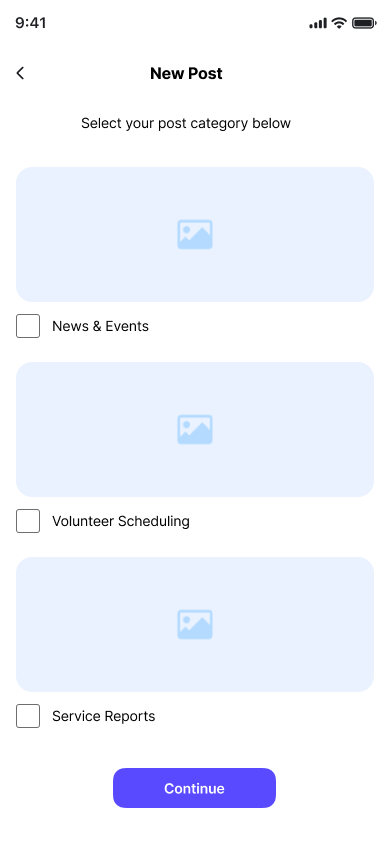
add new post to homepage
Final Design
Each screen included in the final design represents a realization of my contributions, reflecting a combination of stakeholder insights, user feedback, and design expertise. Throughout the design journey, every page underwent multiple iterations, undergoing scrutiny from both stakeholders and team members alike. This rigorous process ensured that each element, from the Account Creation to the Homepage and beyond, seamlessly integrated stakeholder requirements and user needs, ultimately resulting in a cohesive and user-centric app interface.
Images of the splash screen, get started, account creation and add image screens.
Images of the profile creation, profile approval, and log in (with forgot password) screens.
Images of the forgot password, verify code, reset password, and successfully updated screens.
Project Challenges and Takeaways
Throughout the development of the Concordia app, I encountered several challenges that ultimately contributed to valuable insights and lessons learned. One of the most significant takeaways from this project was the importance of translating user feedback into positive iterations. Collaborating closely with team members, I learned the art of effectively communicating and implementing user insights to refine the app's design iteratively.
A key aspect of this project was ensuring alignment between stakeholder vision and user research insights. This required open and transparent communication with stakeholders, allowing us to integrate their vision while keeping user needs at the forefront of decision-making processes. By fostering a collaborative environment, we were able to strike a balance that resulted in a user-centric app design.
However, one notable challenge was encountered during the initial phase of user research, where polling survey responses proved to be difficult. Despite this hurdle, effective project planning by the project manager ensured that the project timeline accommodated potential delays, mitigating the impact on overall progress.
In retrospect, navigating these challenges provided valuable lessons in project management, collaboration, and user-centric design principles. By overcoming obstacles and embracing iterative refinement, we ultimately delivered a Concordia app that harmoniously integrates stakeholder vision with user needs, embodying the essence of effective teamwork and communication in achieving project success.
