Final Web Design
Project Scope
The scope for this project includes a design comp, color scheme, font size, and other design assets that are ready for usage. It also includes a single-page scrollable web design.
Project Overview
I was contacted by feminist photographer Dorothy DeLong about creating a website for her portfolio. She uses this website to showcase her photos in an effort to draw in potential customers.
Project Role
As the project's lone designer, I worked closely with Dorothy to understand her objectives for the website's design and execution.
Project Goal and Problem
Dorothy Delong explores the country to capture stunning images of individuals going about their daily lives in their element. She used a Facebook page to publish these images, but as they gained popularity, she needed a more formal channel to show off her work to magazines, galleries, and the general public.
When the project is finished, Dorothy will have a one-page website where she may display her work and upload new pictures as she expands her portfolio. It will have a place for her artist's statement, a photo of her, and a simple way for anybody who wants to use or exhibit her work to get in touch with her.
The Process
Design Research
I provided Dorothy with a questionnaire to complete, and doing so helped me to better understand her website's objectives. I learned a lot about Dorothy's artist statement, self-portrait, logo, photographic samples, self-quote, favorite and least favorite portfolio websites, and more. All of these, along with my research on photography websites, significantly influenced my decisions about the color scheme, typography, and overall design.
paper wireframe sketch
Wireframe Sketch
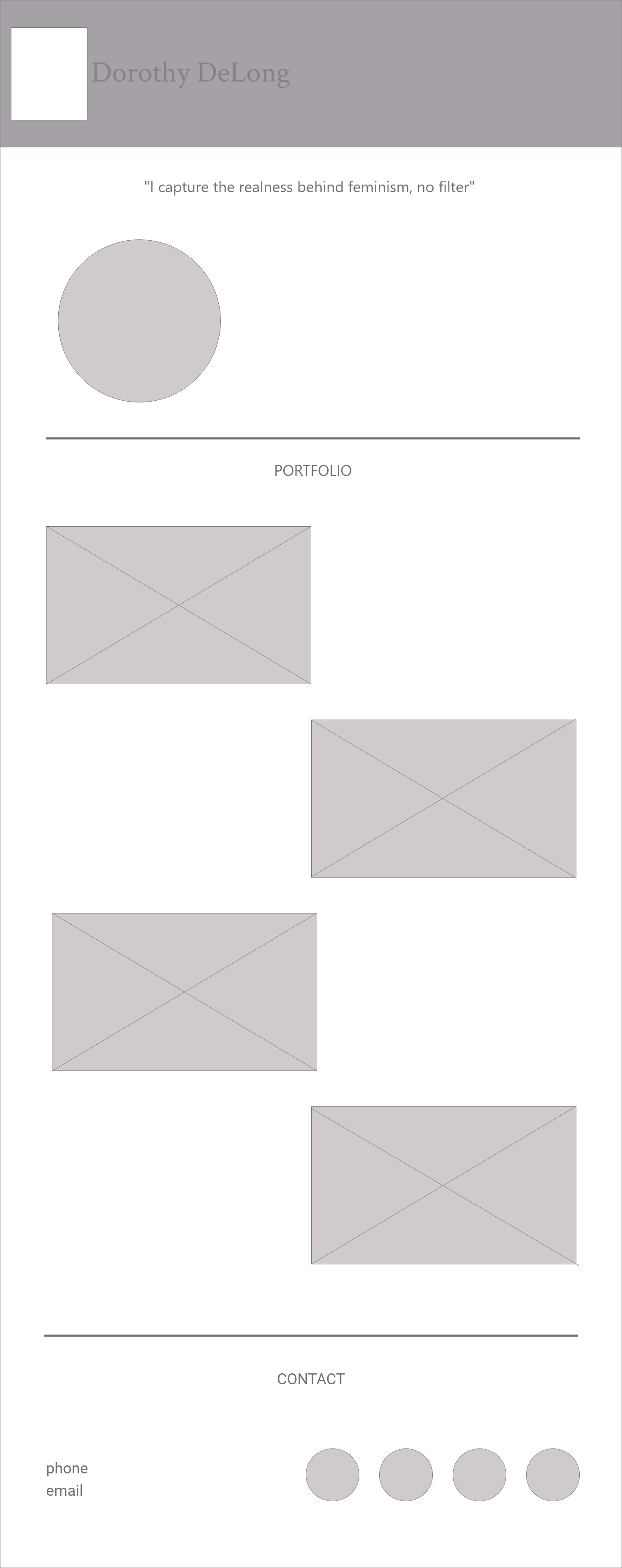
I made a rough layout of the website on paper using Dorothy's objectives as guidance. I went with a straightforward navigation design, placing her name and logo at the top, then her photo and artist statement.
This clarifies Dorothy's values for anyone visiting the website and gives her portfolio of work, which is the section after, greater context. The next section is her contact information, which includes links to her social media accounts for those who want to get in touch with her after viewing her work.

Digital wireframe

Low-Fidelity comp

High-Fidelity comp
Digital Wireframe
To build the design digitally, I imported the basic sketch into Adobe XD.
I inserted the text to better understand the structure as a whole and determine how much room each section requires. I avoided using color or a particular typeface so that I could concentrate on the spacing and arrangement as a whole. When the basic design is satisfied, these would be added.
Low-Fidelity Comp
To give the layout more context, I applied the colors and typefaces to the wireframe. To avoid drawing attention away from the photographs and to guarantee that the text and purple were sufficiently contrasted with one another, the color purple was only used minimally across the website.
High-Fidelity Comp
After making sure everything was set, I added the images and logo Dorothy provided, as well as a hover effect to the navigation bar and a purple tint to the social media icons to make them stand out.
color scheme and typography for Dorothy's website
Color Scheme and Typography
I wanted the color scheme to precisely capture the power, vulnerability, and community that Dorothy's photos evoke. The color scheme consists of dark purple (#420066), light gray (#707070), and white (#FFFFFF). These hues were chosen so that they would not overshadow the focal point, which is her work, but would instead serve to balance it out.
I wanted the typefaces to be bold and official for the headings and light and contemporary for the navigation and body content. Due to its rich coloring and pointed serifs, I chose to use the Crimson Text typeface for the headings, while Roboto's clean and straightforward design would be used for the body text and navigation.
Final Design
Final design
Challenges and Takeaways
I used Adobe XD when designing, which helped improve my use of the program. It also helped me gain a better understanding of the design trends that were implemented in the site's design. Although I didn't work directly with developers, I made sure that all the layers, design assets, and files that would be needed when developing the site were labeled simply and accurately.
Dorothy decided to include more photographs and a different social media link when she saw the final design. The portfolio section's responsive design made the addition simple and would make future adjustments for Dorothy simple.
Project Conclusion
I designed Dorothy a simple, contemporary website to highlight her work. It includes details on her, examples of her photography, and contact information. Her main objectives are to make her work and contact information easily accessible to anyone who wants to view it or get in touch with her. The layout makes it simple for Dorothy to replace or add new photos without having an impact on other areas.
To make it easier for the developers to code the website, Dorothy received the finished design along with the color codes, fonts, and exported files.


