Final Design Comp
Project Overview and Scope
Sit Conmigo is an ethical, environmentally friendly chair company and was founded by Yolando Lopez. She contacted me to design a responsive single-page website for her new chair collection that would also enable pre-ordering from clients. Due to the likelihood that many of her customers will shop on their phones, she wants a mobile site that looks amazing and functions well.
Project Role
As the lone designer on this project, I collaborated closely with Yolanda to establish and effectively implement her goals for the website.
Project Goal and Problem
Yolanda focuses on ethical and ecological sourcing of materials when creating stunning furniture for Sit Conmigo. For Sit Conmigo to get more customers and develop as a business, it needs to have an online presence and greater visibility outside of its location.
The main objective of this project is to create a website with call-to-actions encouraging visitors to pre-order chairs and emphasize the vision and values of Sit Conmigo. Customers need to be made aware on the website that Sit Conmigo is an ethical business and that its materials are sourced sustainably.
The Process
Design Research
In order to better understand Yolanda's business objectives and vision, I gave her a questionnaire. The questionnaire made it easier for me to comprehend how her company differs from other furniture manufacturers in that it uses fair labor practices to create its chairs and sources its supplies ethically. It became apparent that I needed to make that, along with the pre-order button for customers, the website's main focus, while also emphasizing a positive mobile user experience.
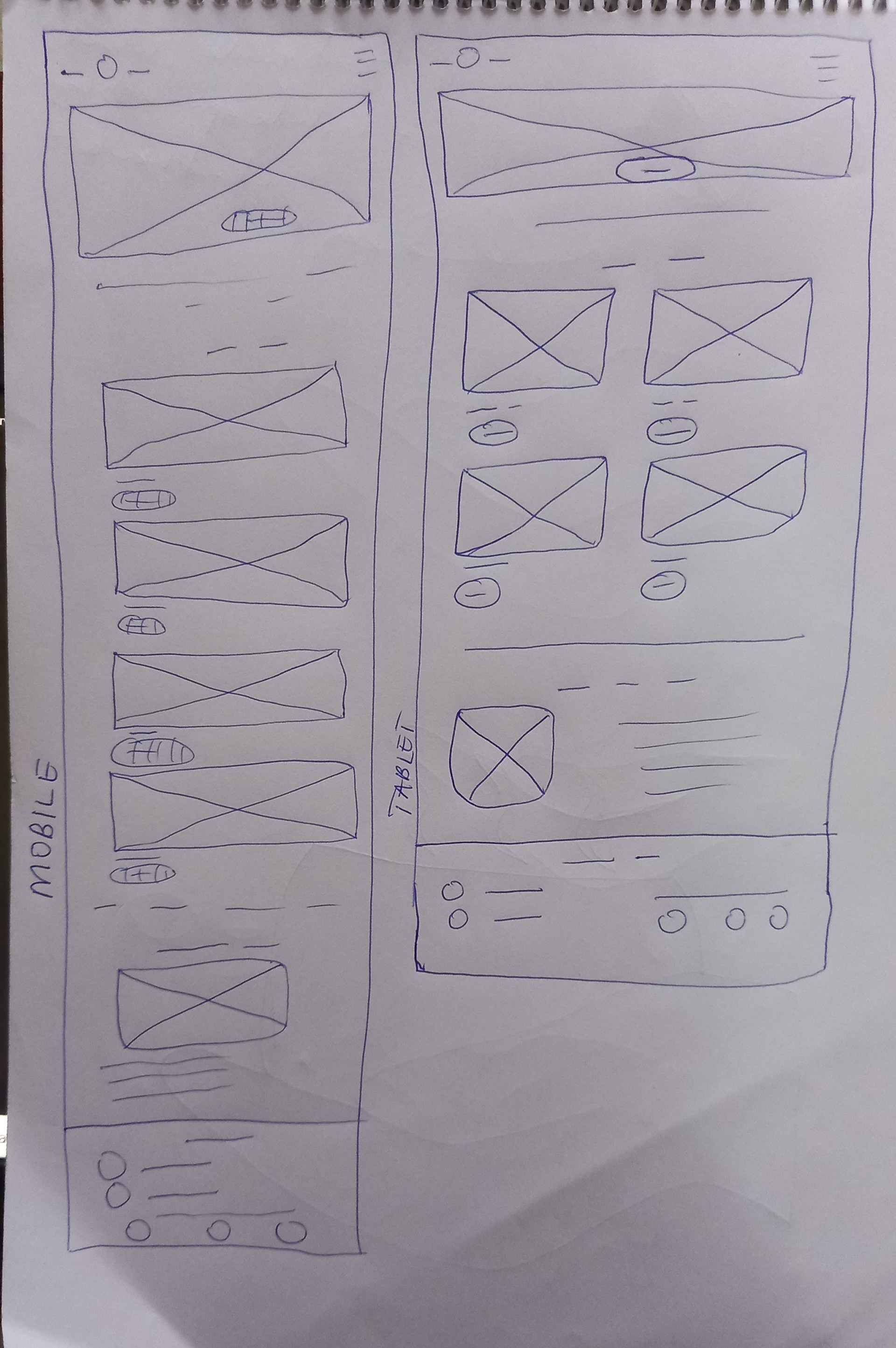
Mobile and tablet paper wireframes
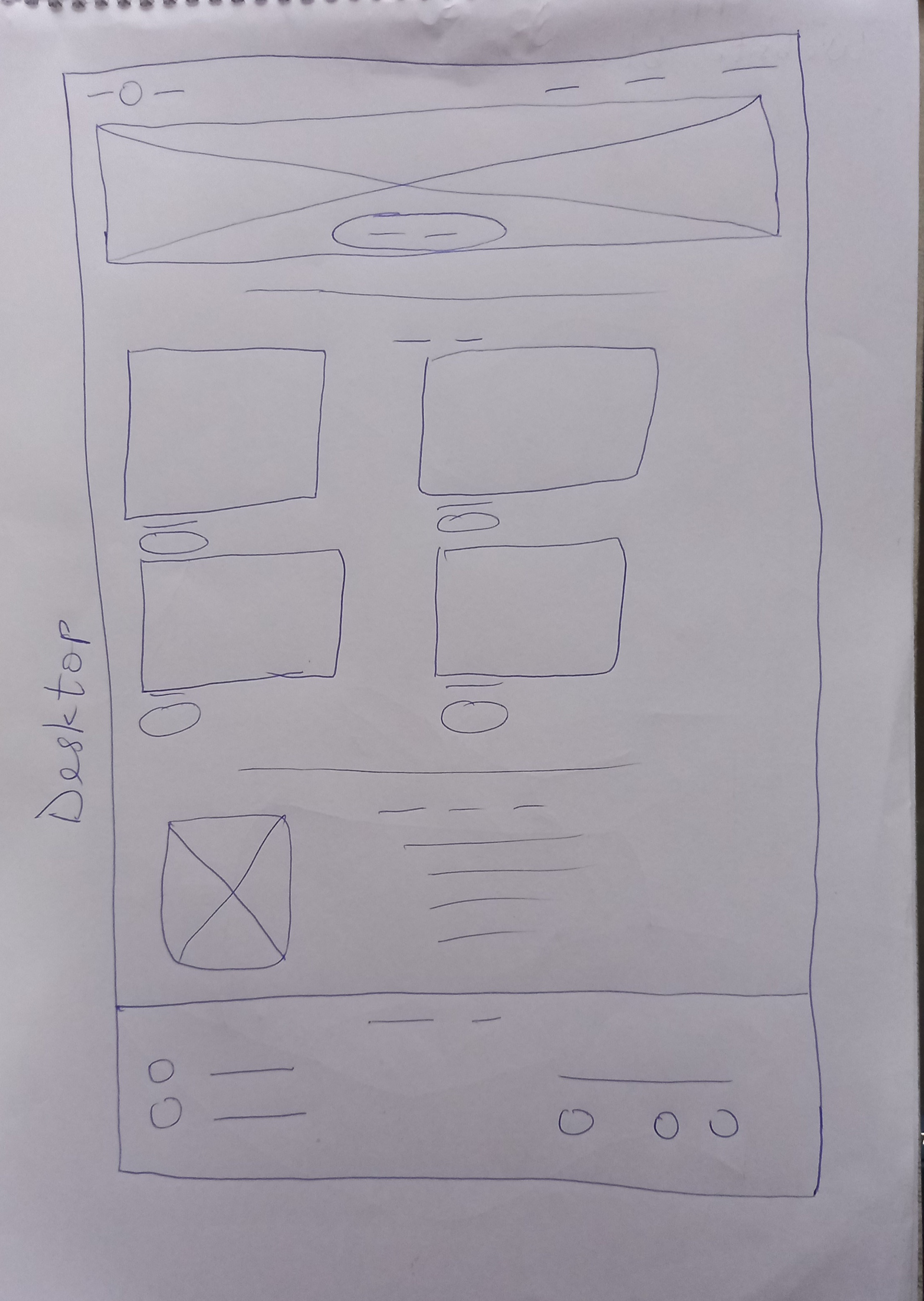
desktop paper wireframe
Wireframe Sketch
I drew a simple mobile wireframe while keeping Yolanda's objectives in mind. I made sure it had a call-to-action button to entice customers to pre-order, and I also made sure that there were obvious, large photos of the chairs that are available for pre-order.
To make sure the layout is constant and fluid across all devices, I started with the mobile wireframe sketch before moving on to the tablet and desktop versions.
Digital Wireframes
After completing the wireframe sketch, I uploaded it into my Adobe XD workspace and started creating the digital wireframes. To ensure that the website's sections were evenly spaced, I inserted Sit Conmigo's contents. The mission statements of Sit Conmigo were also put after each section to help better envision the layout of the website. The chosen colors and typefaces have not yet been added.

mobile digital wireframe

tablet digital wireframe
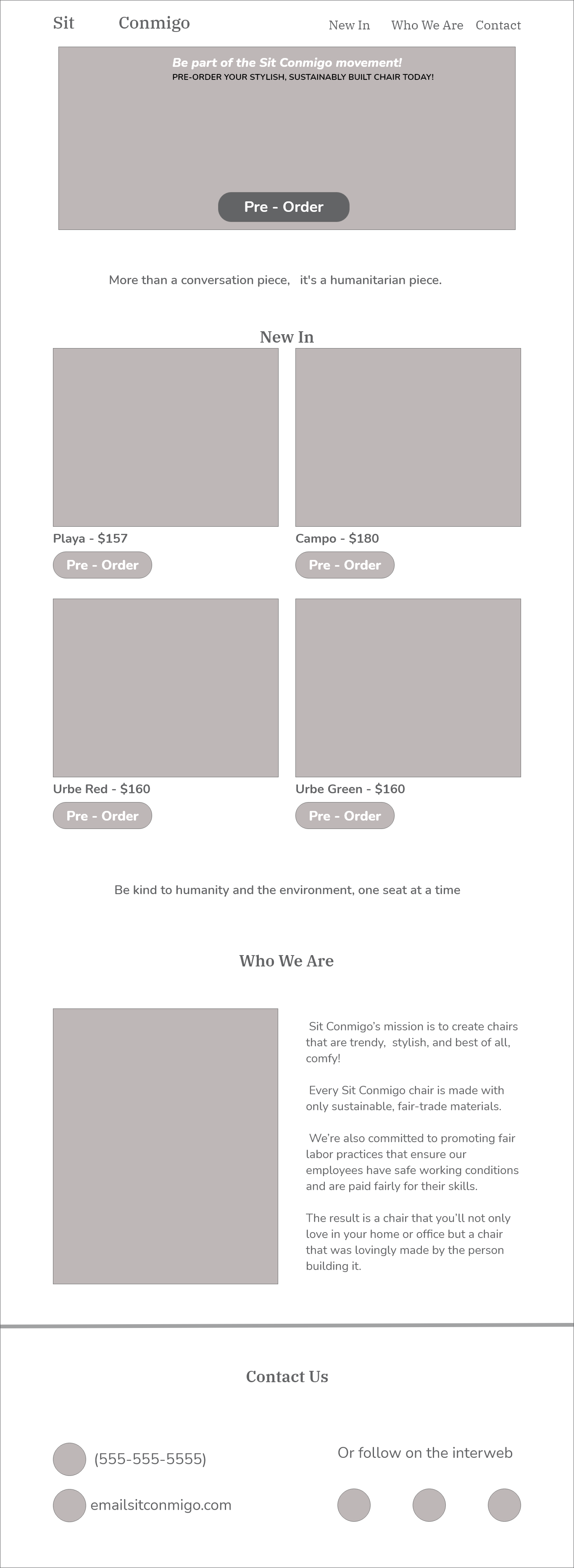
desktop digital wireframe
Color Scheme and typography.
I began the process of selecting colors and typefaces in line with the brand's personality. Yolanda provided images of the chairs that were for sale, and I mostly relied on those images while selecting the colors for the website. I chose a deep blue as the main hue and a warm dull green as the secondary color because the chairs are vibrant with warm undertones.
I used IBM plex serif for the section headings, brand name, and navigation because I wanted the typefaces to correctly reflect the contemporary and elegant sense of Sit Conmigo. It exudes refinement and accurately represents the brand. For the paragraph content, I chose Nunito, a sans serif font that gives the site a distinctly contemporary aesthetic.
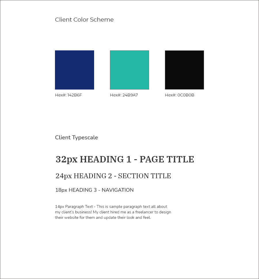
Color scheme and typography for sit conmigo design

Mobile comp

Tablet comp
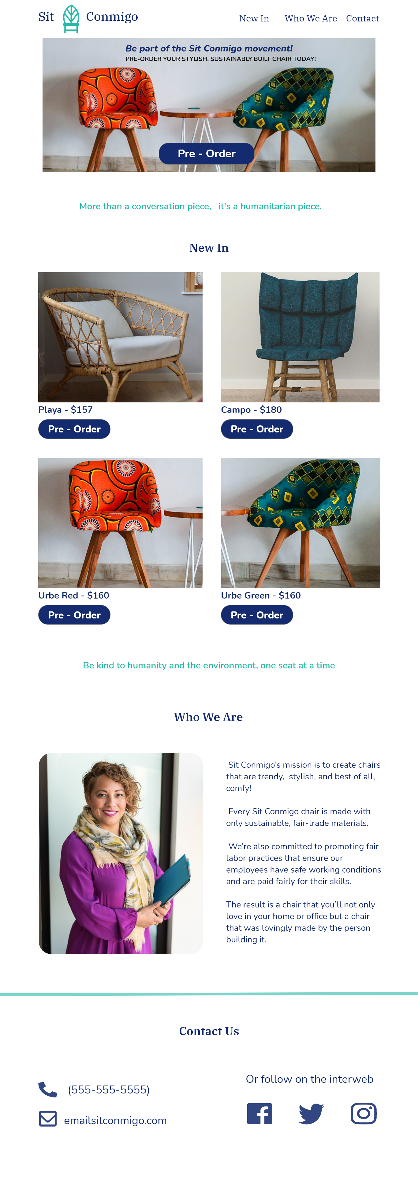
Desktop comp
Digital Comps
I began creating my digital comp after deciding on my colors, layout, and typeface. At this point, I added my colors to the design and saw how they complemented the website's images. When the icons appeared overly bright, I reduced their opacity and worked to make them look balanced.
Following the giant hero image and call to action, there are large closeup pictures of all the available chairs, each with a description and a big pre-order button underneath. These vibrant images stand out against the white background of the website and take center stage, emphasizing Yolanda's designs.
I changed the typeface styles to fit each section, and after adding the styles, I worked to make sure each item was properly aligned. The personal statements symbolize the brand and give it more significance, so I also chose to make them the secondary green hue, much like the logo.
Final Design
Final design
Challenges and Takeaways
The significance of conducting research before designing is what I gained most from this. The aim of this project was to design a website that accurately represents Sit Conmigo. I was able to accomplish this because of Yolanda's participation in my questionnaire and the substantial research I conducted.
With the feedback I received, I was able to research her competitors, websites that inspired her, and websites that she disliked in order to come to a conclusion about what perfectly represents her business. All of these were useful in helping me create a unique and distinctive website.
Yolanda and I communicated frequently so that I could get her opinion on anything I was working on at the moment. This allowed me to quickly make modifications and design with her company's needs in mind.
Project Conclusion
A stylish, contemporary, and friendly one-page design that highlights Sit Conmigo's chairs is the end product of this process. A minimalistic, contemporary, and warm design was the end result of all the design decisions made.
I was able to incorporate Sit Conmigo's mission into various aspects of the site and make sure that the mobile experience was just as engaging as the desktop experience.
