The Whole Bean Logo
Project Scope
I worked with The Whole Bean to develop a comprehensive brand identity. The scope of this project includes a color scheme, typography, social media headers, a logo, icons, and a brand style guide. All these guarantee the brand's unified look and feel.

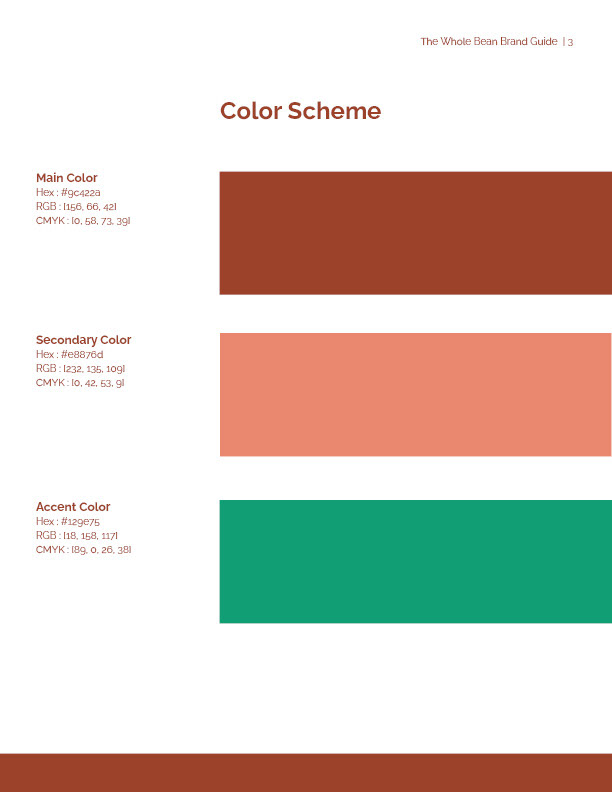
color scheme of the Whole Bean
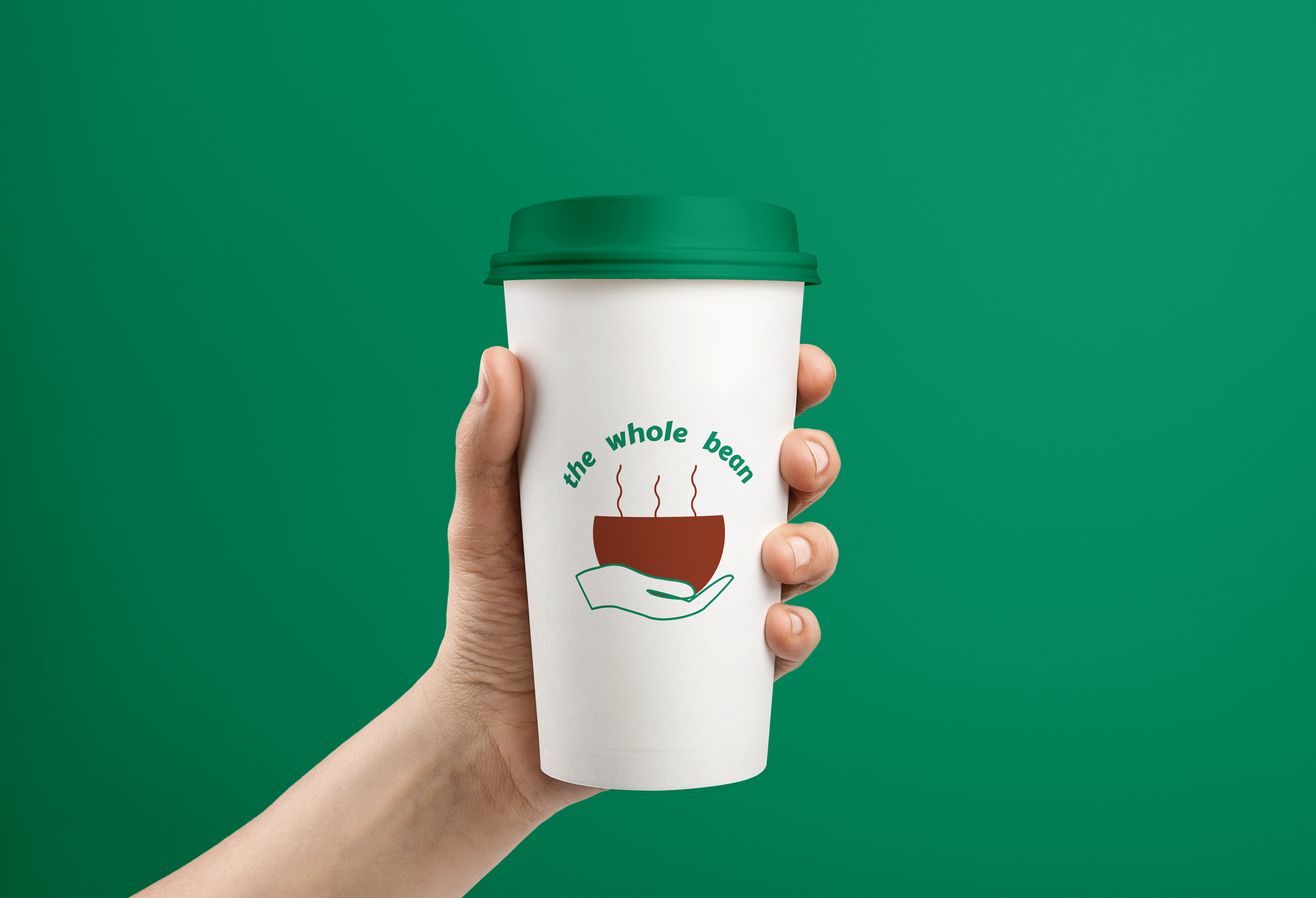
Mockup of the Whole Bean Logo on a styrofoam coffee cup
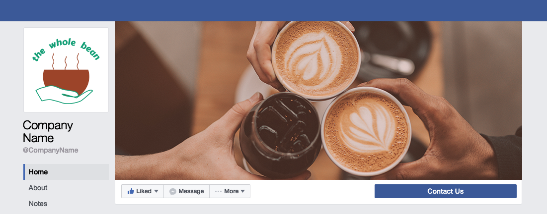
Facebook social media header for The Whole Bean
Project Overview
The Whole Bean is a new coffee shop opening soon and needs branding to ensure that the shop’s look is consistent and shows the personality of the business.
The project involves developing a color scheme, type size, logo, icon set, and comprehensive brand style guide to guide future design choices. With the help of these resources, The Whole Bean will be able to establish a strong brand identity right away and gain the patrons' confidence and familiarity.
Project Role
As the project's lead designer, I worked closely with The Whole Bean's owners to understand the brand's personality and vision, which had an impact on the project.
Project Goal and Problem
The Whole Bean's owners wanted their business to appear approachable enough to draw customers who would return frequently.
Developing a style and feel that precisely reflected the brand's mission and personality was the main objective of the project. When developing the brand identity, I was guided by the information I had gotten from the owners regarding the user personas, brand personality, and goal statement. This made it easier to create a unified look and feel.
The Process
I conducted in-depth research on nearby and far-away coffee shops, taking note of their colors and logos, and communicating with the owners to find out what they did not want. My choice of color scheme, font, and other design components was strongly influenced by the information I had learned about the brand's personality and mission from the owners.
Color scheme for the whole bean
Color Scheme
I made color choices that complemented the owners' desire to create a homey and welcoming atmosphere.
An expression of dependability, freshness, and new beginnings is conveyed by the final color scheme, which is a palette of browns and green. This color combination perfectly encapsulates the essence of The Whole Bean.
Typography
To support The Whole Bean's personality, I looked for typefaces that have a warm and genuine tone.
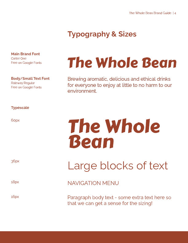
I decided on Carter One for the main brand typeface. Carter One's sans-serif font has a contemporary, crisp design. For large headings and navigation, use Carter One Regular. For lengthy passages of smaller text, such as website body text or menu explanations, I chose the sans-serif font Raleway. This sans-serif typeface will be simple to read while expressing a straightforward and welcoming tone.
Type scale for The Whole Bean
The Whole Bean Logo on a brown background
The Whole Bean Logo on a black background
The Whole Bean logo on a white background
Logo
One cannot emphasize enough the value of a strong logo. The logo, which is the most recognizable component for most brands, serves as their face.
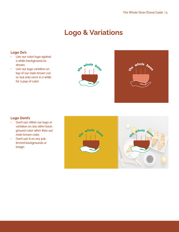
After selecting the colors and typefaces, I drew up a few logo concepts before deciding on one that included a coffee mug with a hand beneath it to symbolize the use of ethically sourced materials.
I made a vector version of the logo in Adobe Illustrator so that it can be scaled to any size without losing quality. For various usage situations, I also made versions of the logo.
Icons
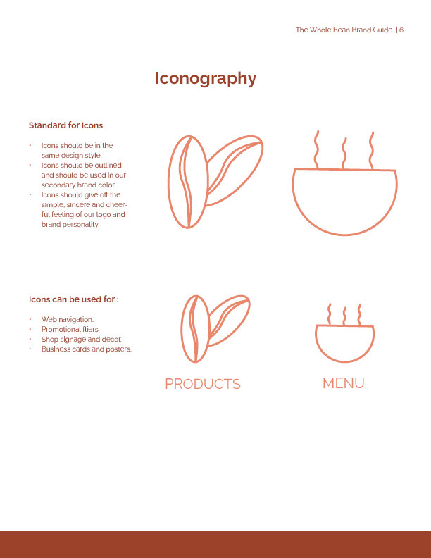
In Adobe Illustrator, I produced two icons for the menu or website. The coffee mug from the logo stands for the menu, which offers a variety of delectable drinks, and the coffee bean stands for products, the majority of which also have cocoa as an available ingredient.
Both icons follow the same color and line design scheme to match the brand's aesthetic.

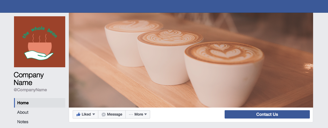
Social Media Header
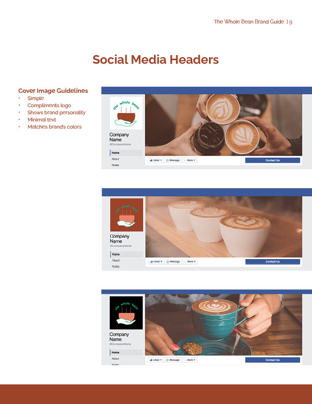
For social media headers, I got pictures that reflected The Whole Bean's character and aesthetic. I came up with three different solutions that can be used in place of one another on various social media sites.
Each header has a hand or a cup of coffee to reference the brand's logo. The headers also have various brown hues from the color scheme.
The social media headers and mockups, including the Facebook cover photos, were made using Adobe Photoshop.
Final Design
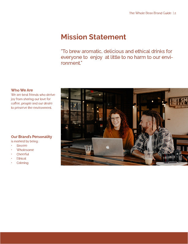
One page of the Brand Style Guide showing the company's Mission Statement & Brand Personality
Brand Guide
The Whole Bean's complete brand style guide, which unifies all of its branding components and provides usage instructions, is the last component of its branding package.
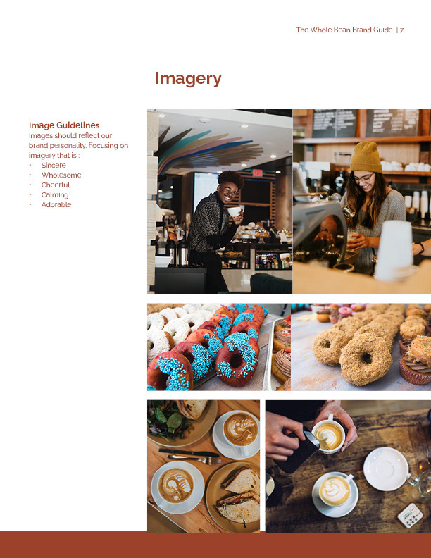
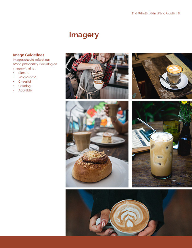
Using Adobe InDesign, I built the style guide to give it a unique appearance and feel that complemented the brand's colors and font. I covered the company's goals, personality, color scheme (in CMYK, RGB, and Hex formats), font names, sample sizes, usage instructions for logos, icons, social media header guidelines, and pictures in the style guide.
The Whole Bean will be able to preserve its brand identity by using the complete product in both physical and digital modes.
View the style guide PDF or see the pages below.

Takeaways
Due to the upcoming launch of the brand, I had to work within a limited deadline. It was difficult at first with the variety of possibilities available to come up with a logo that completely symbolizes the brand and appears unique. But the more I researched and drew my thoughts, the simpler it was for me to come up with the final design.
I continually discussed my plans with the owners to make sure I was on the right track and taking their views into account. All of these contributed to reducing the number of revisions that needed to be made at the conclusion of the project, which enabled me to finish it in time for the launch.
I was able to use several design software packages (Adobe Illustrator, Photoshop, and InDesign) as a result of this project to produce designs that guarantee a unified look and feel. This gave me the freedom to choose the best program for the job at hand, whether it was making a vector graphic that could be scaled up or down without losing quality, developing captivating social media headers, or putting together a standardized layout for a style guide. I also learned that I should give myself some extra time for client feedback so that I may make adjustments without affecting the project's overall schedule.
Project Conclusion
The Whole Bean had a comprehensive branding package to help create its brand identity when the project was finished. The color scheme, typography, logo in several variations, icons, images, and social media headers were all included in the bundle. All of their branding is kept in one location with a detailed style guide that includes usage guidelines for each component.
Due to these assets, The Whole Bean can create interest for its launch on its website and social media channels. The store can display online versions of its logo, icons, and colors. Its main objective is to increase brand awareness and credibility through this.

